This isn’t anything particularly sophisticated; I just wanted to record a trick that I recently applied when redesigning my personal website.
I wanted the effect of some purely decorative background text. My constraints were:
This ruled out the most obvious ways to achieve this effect, including a background image or a <div> just containing raw text.
It was also difficult to load text based on the user’s screen size without Javascript. This could possibly be done with media queries, but even then I’d have to decide on an upper limit of how much text I wanted to keep ready. My initial idea was to have the entire viewport background be a wall of text, but I decided instead to set the content to a centered container whose dimensions are at most 600px.
I finally decided to add in the text in the CSS with the content property on the ::before and ::after pseudo-elements. So the page looks something like this:
<div>
  <!-- Actual content here -->
</div>
<div class="background"></div>
And we simply style it with
.background {
  z-index: -1;
}
.background::before {
  content: "This is the background text content";
}
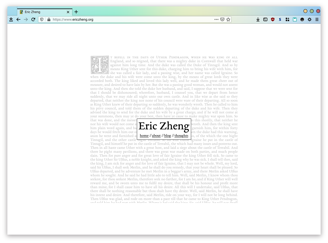
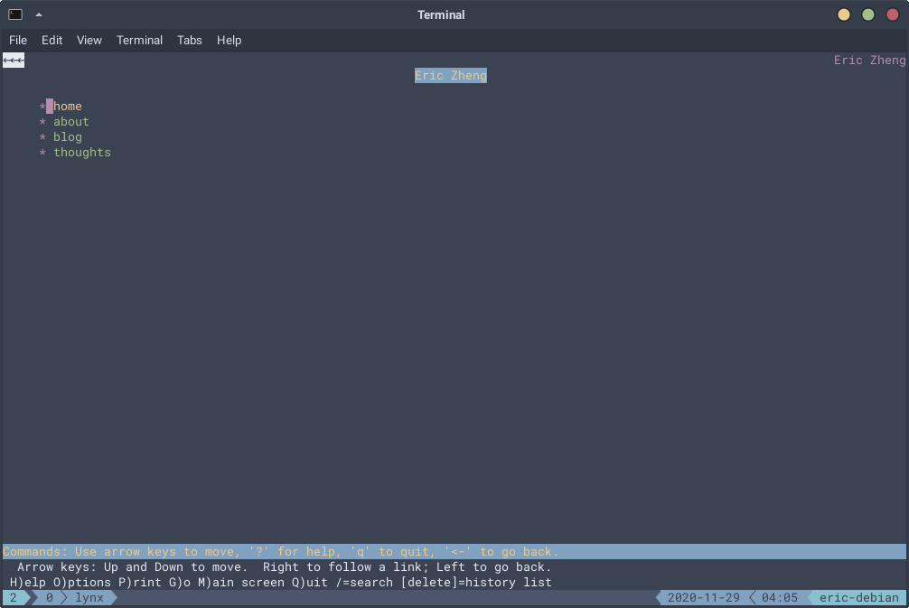
The following two images show how it renders in Firefox and Lynx respectively:


I actually ended up putting the first character (with the fancy floral font) in its own <span> element, since there were some discrepancies between how Firefox and Chrome rendered the page when I tried styling it with the ::first-letter selector.
The ::before and ::after pseudo-elements are also quite useful for things like citations. You can throw in a prefix:
cite::before {
  content: "— ";
}
Then any citations like <cite>Book of Armaments, 2:9-21</cite> become “— Book of Armaments, 2:9-21.”
Comments