Over winter break, I’ve been adding lots of stuff to my website. The biggest one has been the life section, where I’m writing casual posts about my life. At this point, it’s mostly just bad vacation photos.
But this begets an interesting question: how do I display these photo galleries in an attractive way? The current image display pipeline used in my cycling ride reports is pretty ad hoc: it’s centered on <figure> elements which may have one, two, or three <img> elements under them, followed by a <figcaption> element. This is what it usually looks like:
<figure>
  <img />
  <img />
  <img />
  <figcaption></figcaption>
</figure>
I use a nifty CSS trick that I found online to automatically size the images based on how many there are in a given figure:
/* one image in figure */
figure img:first-child:nth-last-child(2) {
  max-width: 100%;
}

/* two images in figure */
figure img:first-child:nth-last-child(3),
figure img:first-child:nth-last-child(3) ~ img {
  max-width: 45%;
}

/* three images in figure */
figure img:first-child:nth-last-child(4),
figure img:first-child:nth-last-child(4) ~ img {
  max-width: 30%;
}
But this obviously doesn’t scale very well, and it only looks good under the assumption that there are at most three images, and they’re all landscape photos with the same aspect ratio. This is a pretty solid assumption for the pictures I take while cycling, but it turns out that this isn’t so good for my vacation photos: some are portrait photos, some are panoramas, and some are taken on different cameras with their own aspect ratios. Is there a way to automatically lay out such images in a reasonably attractive way?
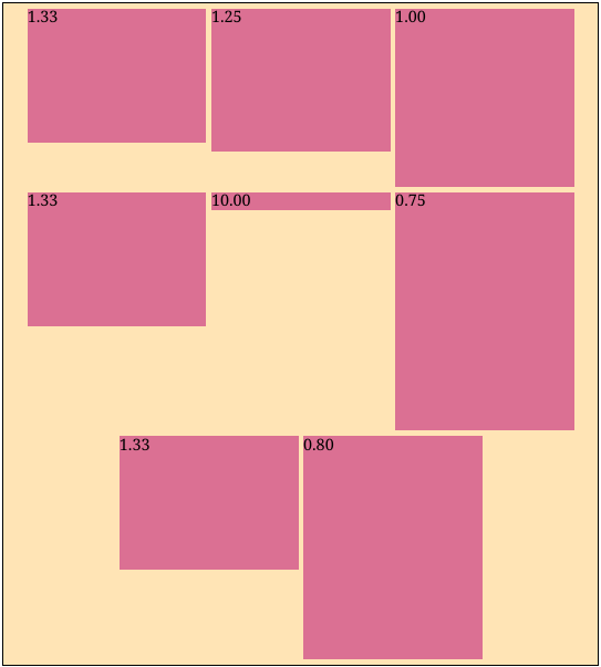
To be a little more concrete, suppose we have a gallery of eight images with aspect ratios 4:3, 5:4, 1:1, 4:3, 10:1, 4:3, 3:4, and 4:5. If we just set each image to have a width taking up 30% of the parent width (the way I was doing it before), we get this atrocious result:
Of course, this would never do. You could always adjust the image scaling factors by hand, but this quickly becomes tedious and is not really a robust solution. What if you wanted to add another image?
Often times, the simplest solutions are the best ones, so it’s worth taking some time to consider the simplest possible solution to this problem: forcing all of the images to be the same size so that the dumb layout idea “just works.” Usually, image galleries on my website only contain low-resolution thumbnails; you can click somewhere to get the original image file. Given this, it would seem reasonable to try to generate the thumbnails in such a way that they are all the same aspect ratio (say, 4:3, the default for my smartphone camera).
There are a couple of plausible ways to do this; a pretty good guide is here. The most obvious is just cropping some 4:3 region out of the image, presumably from the center. However, this has an obvious drawback: you’re going to miss features that occur away from the center of the image. Perhaps you could try to intelligently choose which area of the image to keep, using techniques such as facial recognition. But there are still a couple of problems with this:
Another option is to use a content-aware algorithm for image resizing; a really interesting one is seam carving1. It’s a fantastically cool algorithm; I encourage you to look it up if you haven’t seen it before.
However, any such algorithm runs the risk of distorting the image too much. We can try to protect parts of the image that are especially sensitive to distortion (like human faces), but it may be the case that there’s no way to resize the image to fix the desired aspect ratio without distorting it unacceptably. This isn’t a hypothetical concern: consider a group photo with many human faces and figures. Resizing the image may require distorting people’s faces and bodies, which does not look very good.
In general, it seems that coming up with a robust way to generate high-quality thumbnails in some uniform aspect ratio is at least as hard as finding a good layout with the original image aspect ratios. It just so happened that I had lost the motivation to write the project that I had originally intended to do over break.2 This task seemed much easier, so I instead wrote a small Javascript tool called “Jigsaw” to find such suitable layouts.
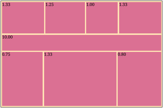
Beauty is, of course, in the eye of the beholder, but this is the layout that I was going for given the previous example:
Let’s define the problem a little more precisely. Given a list of images described by their aspect ratios and some desired margin/padding around images, we want to find a set of widths for the images such that:
For convenience, we’ll define our units so that the container has unit width. Let’s first treat the case where all of the images are in one row: in this case, the first condition—filling up the container width—means that we require The second condition, that the height of each image is the same, simply means that for . This set of conditions is nice because it’s both aesthetically pleasing and computationally simple; it’s a fully determined linear system! We can easily solve for the unique widths which satisfy these equations. In fact, we don’t even need a general solver; this system is simple enough to solve with basic arithmetic operations.
But this only handles the case where all of the images are in a single row. How do we choose where to break the rows? The simplest possible thing is to try every possible way to break the list of images into nonempty rows while still respecting the order. We then choose the layout which minimizes some objective function. There are many choices of the objective, but a natural one might be to minimize the total squared deviation of the row heights from some “ideal” row height. In practice, my galleries tend to have many pictures that have a 4:3 aspect ratio, and on a typical screen width, having three of these side by side (for an overall row height of in normalized units, ignoring the margins) is pleasant. So we might try to minimize an objective function like:
function objective(rows) {
  const ideal_height = 0.25;
  return rows
    .map(row => Math.pow(row.height - ideal_height, 2))
    .reduce((x, y) => x + y);
}
This approach is remarkably simple, but it works quite well in practice; the above “good” layout was found with exactly this objective function.
Of course, there are a couple of obvious drawbacks. It seems like the best choice of objective must depend on the typical image dimensions and the container width. Also, we brute-forced our way through all possible ways to break the images up into rows. There are ways to do this, so clearly this is not going to scale beyond fifteen or so images. I generally don’t have such large galleries on my website, so this works for me, but it’s an interesting problem to try to come up with a better way to split up the rows.
How might we make this faster? As with before, we might first consider the simplest possible approach: given images, break them up into chunks of some small fixed size (say, ). We just try to figure out the best way to break rows within the chunks and append the chunks together.
Besides being very simple, this approach has then benefit of being linear-time, since for a fixed chunk size , the optimization problem is constant-time. However, the main drawback is that we may not necessarily find the globally optimal way to break the rows. In particular, we’ll miss any solution that contains a row that crosses a chunk boundary. It’s possible that the layout we find will still be acceptably good, but it would be nice to find the real optimum.
One particularly egregious example is this: say you have a bunch of images of the same aspect ratio, and the ideal layout is to put them three in a row. If the chunk size is not divisible by three, we will miss the obvious solution of just putting three in a row. In general, choosing a good value of is difficult: too large and the problem becomes computationally infeasible (asymptotic linear time is of no use if the constant is something like ); too small and the result may be much worse than the true optimum.
To motivate a better way to break the rows, let’s visit a similar problem: line breaking when laying out justified paragraphs of text. This is not exactly the same thing; you justify text by expanding “glue” elements (i.e. spaces) in a line3, not by adjusting the line height. This leads to a very different objective function to minimize, but the basic shape of the problem is the same: we want to find the optimal way to break up a sequence of items. In both cases, the naive approach is exponential in complexity.
Donald Knuth, the inventor of TeX, is perhaps the most well-known figure when it comes to computer typesetting; practically anyone who is serious about math, physics, or computer science has used his layout algorithms when writing. He wrote an interesting paper4 with Michael Plass describing a dynamic programming approach to line breaking. They scan through a paragraph, keeping a list of feasible break points and remembering the best way to get to a given break point. The way they break things is not exactly the same as in our case: on the one hand, they need to worry about sometimes breaking up words in the middle (i.e. hyphenation), while we can take individual images as atomic things that cannot be broken up. However, there are also generally far fewer feasible break points in a paragraph of text than there are in a list of images.
There are a lot of additional details that they painstakingly go over5, but they aren’t really important for our purposes. Their basic dynamic programming approach, mutatis mutandis, is all we need to come up with an algorithm. Let’s define the cost to be the best possible value of the objective function after layout out images , for . Clearly we have , since the only way to lay out one image is to put it in its own row. For , we have more choices:
This leads to an obvious dynamic programming algorithm to compute the best cost to lay out the images , and we can keep track of back-references to efficiently determine which row breaks we chose to obtain the optimal cost.
There are a couple of details that need to be noted:
The objective function now computes the cost of each row; we are minimizing the total objective function over all rows. Before, when we were doing the brute-force approach, we could look at the entire layout when deciding what the cost would be, but here we only have information about a single row. This isn’t a big deal for our minimum squared error objective from before, but it could be for more advanced cost models.
We’ve assumed that there’s a constant-time way to evaluate the objective for any potential row . Is this reasonable? So long as the objective function depends on things we can figure out in constant-time, this is fine. An obvious example of something we can figure out in time is the number of images in the row; this is just .
More subtly, we can actually figure out in what the height of would be when laid out! Rearranging our previous equations, we get that the height is where are the aspect ratios of the images and is the desired margin. But we can compute contiguous sums by noting that where we can pre-compute all the prefix sums in time. All this is to say that we can indeed evaluate our minimum squared error objective for a given row in time.
But modulo these details, the straightforward algorithm more or less works, and we can now handle galleries of up to around a thousand images. I’m not sure that there’s ever a use case when one would need to lay out a greater number of images simultaneously.
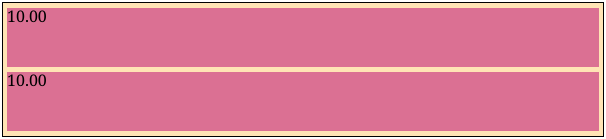
Another improvement that we can consider is trying to come up with a better default objective function. Previously, if we had rows with heights , we tried to minimize for some “ideal” row height (by default set at ). But there’s a problem with this: the number of rows is not fixed for different layouts. Because of this, our objective function artificially prefers layouts with smaller . This is most evident when we have many images with a very wide aspect ratio:

Instead, an idea is to minimize the mean squared error over all rows rather than the total, essentially normalizing the squared error by : (I realize now that this is probably why statistics people speak of mean squared error so much. As someone without any data science, statistics, or machine learning background, it was not obvious to me until I worked through this example.) This allows us to find a better solution:
The key is that this is still suitable for our dynamic programming approach; we can adjust the mean in constant time by keeping track of how many rows there were in the optimal solution at each point. I’ll leave the details as an exercise for the reader.
Another idea to improve the objective function: currently, we treat deviations from in both directions as equally bad, but it’s not clear that this is the correct behavior. In particular, it seems much worse to have height than it is to have height , since a row with a tiny height is nearly impossible to see. In general, our objective looks something like but we could conceivably have, say, or something similar.
One can go on and on with improving the objective function. For instance, our objective function should probably depend on the screen width; what looks good on a small smartphone screen probably does not look very good on a large desktop monitor, and vice versa. Rather than continuing with this, I decided to write a reasonable default objective function but also allow the user to pass in a custom one.
There are a lot of interesting extensions that can be made to this system. For instance, unlike words in a paragraph, we may wish to allow the images in a gallery to be displayed out of order. It seems like usually we want to respect the order of images (for instance, the order may convey chronology), but allowing unordered display might allow us to find a better layout.
Even more drastically, we might do away with the row-based layouts and instead seek to find the best planar tiling. I suspect that plenty of work has gone into studying this problem, but I am not very familiar with it.
We can also look into allowing “global” objective functions that look at the entire layout when computing the cost, as opposed to “local” ones that look at individual rows. It is not clear how this would fit into the dynamic programming approach; in this case, perhaps we would need a different technique, such as gradient descent.
There’s also a nice way to implement seam carving using dynamic programming; this sometimes comes up in introductory algorithms classes.↩︎
If you’re curious, it involved substantial LATEX macro programming, which is why I put it on the back burner.↩︎
Or at least this is how TeX does it.↩︎
Donald E. Knuth and Michael F. Plass, “Breaking Paragraphs into Lines”, Software—Practice and Experience 11, 1119–1184 (1981)↩︎
Fun fact: apparently, before the late 1990s, certain words in German actually changed their spelling when hyphenated. In his TeXbook, Knuth gives the example of “backen,” which turns into “bak-ken.”↩︎
Comments