
The other day, I was playing with some CSS to try to achieve a fancy first character effect in a reasonably cross-browser way. I was going for something like this (which worked in Firefox, but not Chrome):

This is not terribly difficult to do, and in fact you’ll see some similar styling on the index page of this site. (I won’t link to it because the design may eventually evolve, but I believe there’s an image of it in another CSS post.) But I wanted to achieve this using only CSS, because it feels like this should be a purely stylistic choice that shouldn’t have anything to do with the content. So I wanted the HTML to be quite simple:
<p>
  Had Dr. Johnson written his own life...
</p>
The effect should be generated purely using CSS. An old trick that I had encountered somewhere in the past was to use the ::first-letter pseudo-element, floating it so that the page content is automatically wrapped around it:
p::first-letter {
  float: left;
  font-size: 500%;  /* or something similarly massive */
}
However, I ran into a slight problem: there was a discrepancy between how Firefox (my usual browser of choice) and Chrome rendered this! I’m actually not sure which one is doing it “correctly,” and as I’m not on a Macintosh, I can’t bring in Safari to get a third opinion. So here I’ll just chronicle the differences and leave it to someone more versed in arcane CSS lore than I am to tell which (if any) browser is right.
If you’d like to try this at home, the fonts I’ve used here are the same as those on my website: EB Garamond for the body text and Floral Capitals for the fancy letters. This is not motivated by any particular typographic concerns (that’s not my field of expertise), but I just think they look classy. You shouldn’t need these specific fonts, but it probably helps for reproducibility.
Let’s start again with the original basic HTML page:
<!-- plain HTML example -->
<p>
  While confined here in the Birmingham city jail, I came across your
  recent statement calling our present activities “unwise and untimely.”
</p>
In the CSS, we will highlight the <p> element and its first character:
p {
  border: 1px solid blue;
}
p::first-letter {
  background: red;
}
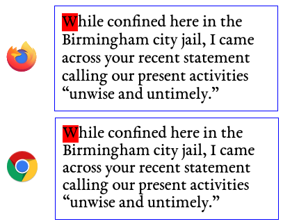
As you can see, it renders essentially identically in Firefox and in Chrome:
But now, let’s add the floating effect on the first letter:
p::first-letter {
  background: red;
  float: left;
}
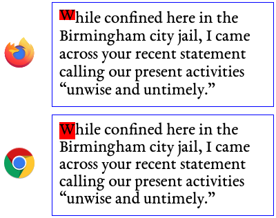
The background: red; highlights what the browser thinks is the content area of the element. We immediately see a difference: Firefox only highlights a very tight box around the letter, while Chrome highlights the whole thing:
This has a big impact on how text is flowed around the letter when we increase its font size. Applying the increase:
p::first-letter {
  background: red;
  float: left;
  font-size: 500%;
}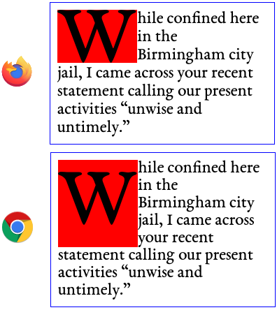
Firefox does look a little better here, but I’m not sure if this is the correct behavior. Examining the font metrics with Font Forge, on a 1000 em size, we have an ascender height of 890 and a descender height of 274, for a total height of 1164. For the purposes of this example, I’ve set the root font size on the html element to be 20px, so we’d expect an actual height scaled by 1.164, or 23.28px. Note that with the Chrome rendering, it’s possible to achieve the same effect as with the Firefox rendering by adding a negative margin to the ::first-letter pseudo-element and adjusting the line-height property.
This would be an interesting enough difference in itself, but the plot thickens! Rather than simply selecting the first character with the ::first-letter pseudo-element, which would be ideal, we can directly specify it with some HTML markup, like so:
<!-- marked-up HTML example -->
<p>
  <span>W</span>hile confined here in the Birmingham city jail, I came
  across your recent statement calling our present activities “unwise
  and untimely.”
</p>
Now if we apply the CSS rules to the ::first-letter, we get the same results as last time. But Firefox actually changes its mind to agree with Chrome if we apply it instead to the span element. If you squint, there are still some slight differences between the two browsers; I’ve blown up the font size to 500% so that you can see the differences more clearly:
span {
  background: red;
  float: left;
  font-size: 500%;
}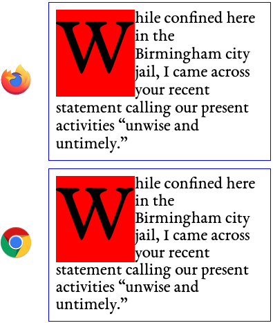
span insteadBut Firefox still decides that the content-area box, where the background property is applied, should be much bigger. This seems to be good reason to believe that Firefox is just mishandling the ::first-letter pseudo-element, but here is perhaps more evidence: let’s try using both the span and the ::first-letter. To see what each browser considers the first letter, after the span is put there, we can simply highlight it in red like we’ve been doing. When the span is displayed inline (i.e. not floated), we get exactly what we’d expect, with the red highlighting around the “W”. But when we float the span, the results differ:
::first-letter {
  background: red;
}
span {
  float: left;
}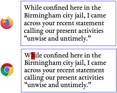
span isChrome decides that the “h” is the first letter, whereas Firefox seemingly decides that there is no first letter!
Interestingly, if we switch it up and try to highlight the span element but apply the float attribute to the ::first-letter, neither browser actually highlights the span:
::first-letter {
  float: left;
}
span {
  background: red;
}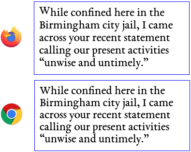
span has zero width when the first letter is floatedAgain, I’m no CSS guru, so perhaps this is technically the correct behavior. But I suppose the moral of the story is that when fonts get involved, CSS becomes kind of complicated and counter-intuitive. Perhaps this blog post would make for good further reading if you’re interested.
Comments